- Benjamin Moore’s 2026 Color of the Year is “Silhouette” (AF-655): a deep espresso-brown with charcoal undertones that offers a sophisticated, warm neutral alternative to black housebeautiful.com. The shade, unveiled on October 16, 2025, is reminiscent of a custom-tailored suit, signaling a return to classic elegance in home décor housebeautiful.com.
- Trend Towards Timeless Warmth: Design experts say Silhouette reflects a broader shift away from cool grays and fleeting fads. “Browns have become very, very important… almost becoming a nice substitute to using black… [brown] has a little bit of a softer warmth to it,” notes Andrea Magno, Benjamin Moore’s Director of Color Marketing housebeautiful.com. This pick builds on 2025’s plum-tinted Cinnamon Slate, indicating consumers’ growing appetite for cozy, enduring hues over “micro-trends” that come and go housebeautiful.com elledecor.com.
- Fashion-Infused Inspiration: The 2026 choice was heavily influenced by fashion’s return to tailored layers. “The connection between fashion and interiors kept popping up again and again,” says Hannah Yeo, Benjamin Moore’s senior color marketing manager elledecor.com. Silhouette’s refined vibe mirrors the comeback of classic suiting—think rich fabrics, detailed stitching, and layered craftsmanship—now translated into wall color housebeautiful.com realsimple.com.
- 8-Color Palette for 2026: Alongside Silhouette, Benjamin Moore introduced a Color Trends 2026 palette of eight coordinating shades housebeautiful.com elledecor.com. Split into “enchanting pales” and “handsome midtones,” the palette ranges from nuanced neutrals like Swiss Coffee OC-45 (a top-selling warm off-white) to atmospheric midtones like Narragansett Green HC-157 (a blackened teal) elledecor.com elledecor.com. The palette aims to empower personalized, layered designs – “a shift toward personalized, considered design” as the company describes it elledecor.com.
- Competitors Also Embrace Calm Colors: Benjamin Moore isn’t alone. Sherwin-Williams named a khaki-beige “Universal Khaki” as its 2026 Color of the Year, calling it a “structured, foundational color” for a turbulent era elledecor.com. Valspar picked “Warm Eucalyptus,” a vintage-inspired soft green that delivers “nostalgic comfort and calm” elledecor.com. Paint makers big and small – from Behr’s smoky jade “Hidden Gem” to Glidden’s cozy red “Warm Mahogany” – are converging on soothing, earthy tones for 2026 elledecor.com elledecor.com.
- Outlook: Colorful Homes, Steady Industry: As homeowners seek comforting palettes for well-being, analysts predict solid demand for paint updates. The U.S. paint and coatings market is forecast to grow modestly (on the order of +5% in value for 2025 vanderkolkpainting.com), suggesting consumers will continue investing in home makeovers. Major paint companies’ stocks remain stable: Sherwin-Williams (SHW) trades around $330–$335 per share investing.com, and paint giant PPG Industries hovers near $100 finance.yahoo.com, reflecting a resilient home improvement sector as we head into 2026. Berkshire Hathaway, which owns Benjamin Moore, also sits near record highs (≈$490 for BRK.B) macrotrends.net.
Benjamin Moore Embraces “Silhouette” – A Sophisticated Spin on Neutral
In a highly anticipated reveal, Benjamin Moore announced “Silhouette AF-655” as its Color of the Year 2026, turning heads with a choice both unexpected and utterly timeless. Silhouette is described as a rich espresso-brown softened by hints of charcoal gray housebeautiful.com. In essence, it’s a warm, deep neutral that many designers see as an elegant alternative to basic black. The paint brand says the hue “emulates the warmth, sophistication, and timelessness of a custom-tailored suit” housebeautiful.com – and indeed Silhouette immediately conjures the feel of a classic dark espresso coat or a luxe piece of leather, bringing a cozy yet refined atmosphere to any space.
“Browns have become very, very important… almost becoming a nice substitute to using black, or using charcoal, because [brown] has a little bit of a softer warmth to it,” explains Andrea Magno, Benjamin Moore’s Director of Color Marketing housebeautiful.com. In recent years, both designers and homeowners have been gradually shifting from the cool gray tones of the 2010s toward warmer neutrals like taupes, beiges, and browns. Silhouette takes this trend to its apex – it’s a darker, bolder brown that still manages to feel inviting rather than stark. Magno and her team “fell in love with Silhouette because it’s rich yet soft, intriguing yet familiar, and bold yet approachable” housebeautiful.com. In other words, the color makes a statement without overwhelming. It works in traditional settings yet reads modern and chic, offering “boundless appeal in a world with growing trend fatigue,” Magno notes housebeautiful.com.
This notion of “trend fatigue” is key. Benjamin Moore deliberately steered toward a hue with staying power. “People aren’t repainting every year, so we want shades that stay relevant for years to come,” says Hannah Yeo, senior color marketing manager, emphasizing longevity over hype realsimple.com. Yeo points out that Silhouette feels like a natural next step from last year’s pick: 2025’s Color of the Year was Cinnamon Slate, a muted plum-brown, and for 2026 the brand “dove deeper” into a moodier, more tailored vibe realsimple.com. By choosing another warm, grounding tone – this time darker and more dramatic – Benjamin Moore is doubling down on the idea that comfort and classic style will outlast any micro-trend. Yeo even uses the term “micro trend fatigue” to describe consumers’ exhaustion with the fast turnover of fads fed by social media elledecor.com. Silhouette is Benjamin Moore’s answer: a hue that is “versatile and classic” enough to transcend one-season wonders elledecor.com.
From Runway to Rooms: A Hue Inspired by Tailored Fashion
One particularly intriguing aspect of Silhouette’s story is its connection to the fashion world. Benjamin Moore’s color team didn’t draw inspiration solely from interior design swatches; they also looked at what was happening on runways and in closets. “This year, we kept going back to this connection between fashion and interiors,” Hannah Yeo explains realsimple.com. What they saw was a resurgence of classic tailoring – suits and layered outfits making a comeback, but with a modern twist. Today’s suits aren’t the stiff, formal uniforms of decades past; they’re more relaxed, comfortable, and textural (think sumptuous fabrics, interesting linings, bespoke details) realsimple.com. According to Yeo, “the return of suiting—but not the stiff, formal kind—really inspired the brand” in choosing Silhouette realsimple.com. The team was enchanted by the notion of a tailored garment that is both refined and comfortable, much like how we want our homes to feel.
That parallel between a well-cut suit and a beautifully designed room is what Silhouette seeks to capture. It’s structured yet cozy, polished yet livable. The Benjamin Moore team even considered the tiny details of a custom suit – the stitching, the layered fabrics, the flash of a colorful lining – and drew analogies to interior design housebeautiful.com. “They were also inspired by the details that go into making a custom suit… and how that layering translates to designing a room,” House Beautiful reports of the color team’s thinking housebeautiful.com. In practice, Silhouette on walls could act like a fine Italian wool on your back – enveloping the space in richness, but neutral enough to let other accents shine.
Because Silhouette is a neutral with depth, designers see endless possibilities for using it at home. On walls and even ceilings of a living room, this mellow brown can make light-colored furniture or artwork pop, all while creating a cocooning vibe housebeautiful.com. As a front door color, Silhouette offers a warm welcome that’s more unexpected than the ubiquitous glossy black housebeautiful.com. And yes, you can absolutely drench an entire room in this hue – imagine a cozy home theater or a library painted from baseboards to ceiling in deep chocolatey brown, instantly transforming it into an intimate retreat housebeautiful.com. Despite its dark tone, Silhouette’s softness means it won’t feel oppressive; instead, it brings a sense of comfort and sophistication, much like dimming the lights to a perfect warm glow.
Inside the 2026 Palette: Enchanting Pales and Handsome Midtones
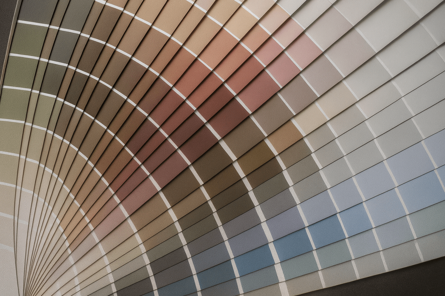
To complement Silhouette, Benjamin Moore released a full Color Trends 2026 palette – and it’s a study in balance and nuance. The palette contains eight colors divided into two groups the brand playfully calls “enchanting pales” and “handsome midtones” elledecor.com. The idea is to provide a harmonious selection of paint colors that can stand alone or be artfully combined for layered, personalized interiors elledecor.com. “Thread craftsmanship into any design with this artfully balanced selection of ethereally lifted and deeply grounded hues,” the company declares, signaling a “return to timeless classics and thoughtful attention to detail” in design benjaminmoore.com.
So, what are these colors? The “enchanting pales” are four light yet character-rich neutrals – notably not plain whites, but complex tints that add subtle personality. Swiss Coffee OC-45, for example, is a creamy off-white and one of Benjamin Moore’s best-selling whites, prized for its warm versatility elledecor.com. First Crush CSP-310 is described as a “tender neutral” with delicate blush undertones, adding a whisper of pink warmth to walls elledecor.com. Batik AF-610 brings a dusty mauve tone, blending soft pink and purple into a vintage-friendly hue that’s surprisingly adaptable despite its hint of rose elledecor.com. Rounding out the light side is Raindance 1572, a steely green-gray that injects an organic, mineral element – it’s like a muted sage with a cool edge elledecor.com. Together, these pales aren’t your grandmother’s pastels; they’re nuanced and calming, meant to create an understated backdrop or to mix with bolder accents.
On the “handsome midtones” side, the palette deepens. Of course, Silhouette AF-655 itself is included here as the anchor dark brown elledecor.com. Then there’s Narragansett Green HC-157, which is actually a blackened teal – think deep ocean green with a dose of black, delivering dramatic moodiness without pure black’s harshness elledecor.com. In a similar vein of earthy depth, Southwest Pottery 048 is an earthy clay color, blending brown, terracotta red, and subtle orange notes; it looks like a potter’s kiln-fired creation in paint form elledecor.com. The final midtone is Sherwood Tan 1054, a robust tan-brown that grounds a space with its warm, earthy presence elledecor.com. None of these midtones are overly loud; they bring depth and coziness without overwhelming a room. Hannah Yeo points out that there’s “so much potential to how you can use these colors”, from full-on color-drenching (painting walls, trim, and even ceilings the same shade for a immersive look) to strategic pops of accent color elledecor.com elledecor.com.
Notably, the palette is designed for interplay. Contrast or tone-on-tone, it’s your choice: Silhouette’s rich brown pairs beautifully with Swiss Coffee’s soft white for a high-contrast, classic look elledecor.com. Alternatively, Silhouette alongside Sherwood Tan creates a layered, tone-on-tone scheme of dark and medium brown that designers find very sophisticated elledecor.com. To prevent the darker colors from feeling too heavy, the lighter First Crush can be brought in to “soften spaces dominated by deeper tones,” notes Yeo elledecor.com. And for those craving a bold punch, Narragansett Green can serve as a striking counterpoint amid the warmer browns and creams elledecor.com – it injects a cool, jewel-toned depth that still harmonizes thanks to its muted, blackened quality. In short, Benjamin Moore’s 2026 palette isn’t about one color, but the conversation between colors in a space. It reflects a design ethos of considered layering, where each hue has a role in creating an overall atmosphere of comfort, personality, and craftsmanship.
Designers Say Goodbye to “Micro-Trends” and Hello to Character
The pivot to Silhouette and its kindred hues signals more than just a color preference – it highlights a cultural mood in interior design. After a decade of dominance by minimalist grays, stark whites, and rapidly shifting fads (remember the chevron craze, millennial pink, or the all-gray-everything look?), many people are craving something different. Homeowners are “looking for something that’s more timeless, something that feels really classic,” Magno observes housebeautiful.com. The constant cycle of new micro-trends blasting through our social media feeds has, in a sense, worn everyone out housebeautiful.com. Now there’s a “reaction to that where people are looking to have good, timeless, classic pieces in their home”, layering their rooms in a way that feels personal and enduring housebeautiful.com.
In practical terms, this means a resurgence of interest in things like rich wood tones, detailed moldings, antique pieces, and heritage colors that don’t date quickly. “We are seeing a lot of moving away from some of the microtrends and people looking for something that’s more timeless,” Magno tells House Beautiful housebeautiful.com. Instead of repainting with the color du jour or swapping out decor constantly, homeowners are investing in palettes and furnishings they truly love – ones that reflect their identity and will age gracefully. Silhouette, being a refined neutral, fits neatly into this philosophy. It’s a shade you can paint a library or living room and enjoy for years without feeling like it’s gone out of style next season.
Designers also note a return of classic architectural details and craftsmanship in homes, which pairs with the warmer color palette. “After years of streamlined, modern spaces, homeowners are gravitating back toward designs with more character,” Yeo explains realsimple.com. That means we’re seeing more crown moldings, wainscoting, textured wallpaper, handcrafted furniture – elements that add soul and depth to interiors. The new neutrals like Silhouette enhance these features rather than blankly washing them out. In fact, a rich color can highlight decorative trim (imagine Silhouette or a deep teal in the recesses of paneled walls – the shadows it creates emphasize the carving and detail). Yeo mentioned seeing something “parallel happening in the interiors world as well with the return of things like crown molding” and intricate layering in design realsimple.com realsimple.com. The common thread? A pushback against impersonal, cookie-cutter looks in favor of authentic, history-inspired styles.
Elle Decor’s trend experts have dubbed this the era of “anti-trend thinking,” where the best “trend” is choosing colors and decor that truly resonate with your personal story and comfort elledecor.com. For 2026, virtually every major paint brand is emphasizing how their chosen color creates a sense of wellness, stability, or nostalgia. There’s a “notable return to craftsmanship and heritage” across the board elledecor.com – whether it’s through warm, woodsy tones that celebrate natural materials or jewel-like hues that evoke historic interiors. Even the youth are contributing: the so-called “tool belt generation” (young adults embracing skilled trades and DIY creativity) has boosted appreciation for utilitarian, earthy colors that feel honest and practical elledecor.com. In short, the maximalist color riots of a few years ago have evolved into a more thoughtful palette that mixes boldness with restraint. Vibrant colors aren’t gone – they’re just used more intentionally, often in rich, classic shades (like burgundies, deep greens, or mustard ochres) rather than neon or purely whimsical tones elledecor.com elledecor.com. And neutrals are no longer just gray and white: they include browns, tans, gentle pinks and greens – all with the goal of nurturing the soul of a space elledecor.com.
Other Brands’ 2026 Picks: Comfort is King Across the Spectrum
Benjamin Moore’s not the only paint company reading the cultural tea leaves this way. Many 2026 Color of the Year announcements from other brands echo the theme of comfort, authenticity, and calm. It’s almost as if the industry collectively decided we all need a hug from our walls next year – delivered in the form of nurturing colors.
Take Sherwin-Williams, for example. The paint giant (along with its sister line HGTV Home) decided to go neutral and named “Universal Khaki” as its 2026 Color of the Year elledecor.com. As the name suggests, it’s a medium khaki-beige, described as an “earthy, mid-tone tan” with a hint of yellow warmth realsimple.com. On the surface it might seem unflashy, but Sherwin-Williams’ color director Sue Wadden says that’s exactly the point. “I know it’s sometimes unexpected to have a color of the year be a neutral, but for many reasons, we feel like it’s the right color for 2026,” Wadden explains realsimple.com. The company sees 2026 as a time to refocus on simplicity and essentialism in design – “drowning out the noise” of overstimulation in favor of what feels essential and comforting realsimple.com. “It’s pretty serious time culturally across the globe,” Wadden notes, “and I think a structured, foundational color is the right story to tell right now.” elledecor.com In other words, Universal Khaki offers a sense of stability (and a break from trend-chasing) much like Silhouette does, albeit in a lighter tone. Sherwin-Williams paired its pick with a whole “Honest Essentials” palette of nine other colors – mostly warm neutrals and a few accent hues like a burgundy and a buttery yellow – all meant to soothe and ground interior spaces realsimple.com realsimple.com.
Meanwhile, Valspar (a brand under Sherwin-Williams’ umbrella) announced a very different color on the surface – a soft green called “Warm Eucalyptus” – yet the narrative sounds familiar. Warm Eucalyptus is a “vintage-inspired soft green” that the company says “embodies tranquility and timelessness” realsimple.com. Sue Kim, Valspar’s color marketing director, says this gentle green reflects our collective desire for “calm, grounding design” amid life’s fast pace realsimple.com. “Warm Eucalyptus is more than just a beautiful shade of green; it’s a reflection of the comfort we crave in our homes,” Kim explains realsimple.com. With its subtle warm undertones and nods to retro decor, the hue aims to provide “restoration and resilience” – a sanctuary vibe for any room realsimple.com. The influences behind it? Valspar saw huge growth in popularity of greens in their data and also tapped into nostalgia and craftsmanship trends realsimple.com realsimple.com. Kim mentions we’re “celebrating raw materials” like wood, cork, linen – and a color drawn from nature fits that perfectly realsimple.com. Nostalgia, too, played a role: “we are looking backwards to plan for the future… a coping mechanism when times are uncertain,” according to Kim realsimple.com. Warm Eucalyptus, with its hint of sage and retro familiarity, captures that “nostalgic note” and encourages us to slow down realsimple.com.
Behr, another big name, went for a richer jewel tone but with a similar intent. Behr’s 2026 Color of the Year is “Hidden Gem,” a smoky jade green-blue that can appear either subtle or statement-making depending on lighting elledecor.com. The company calls it a “blue-green hybrid” that serves as a “new neutral” – bold enough to be interesting, yet versatile enough to work anywhere elledecor.com. Interior designer Manuella Moreira noted, “There isn’t a room where this color doesn’t work… It can be subtle or bold,” highlighting Hidden Gem’s flexibility elledecor.com. Behr is tapping into people’s interest in colors that are both soothing and expressive, offering a bit more pigment than a beige but still enveloping you in comfort elledecor.com. In many ways, it’s a cousin to Silhouette’s philosophy: create an ambiance that can adapt and won’t easily tire the eye. Other paint brands have likewise unveiled colors that nurture and cocoon: Glidden went with “Warm Mahogany,” a cozy, grounded reddish-brown meant as an “anti-trend” statement for those torn between safe and bold choices elledecor.com. The British maker Graham & Brown chose “Divine Damson,” a sumptuous plum intended to bring moody elegance and have a “timeless… universal appeal” across interiors and even fashion elledecor.com. Dutch Boy Paints kept things accessible with “Melodious Ivory,” a creamy beige aimed at “timeless comfort” and the slow living movement elledecor.com. And even Minwax, known for wood stains, picked “Special Walnut” (a warm, earthy brown stain) as its 2026 Color of the Year, citing the renewed appreciation for wood’s natural beauty and nostalgic charm elledecor.com.
The specifics differ, but the common thread is striking: 2026’s colors of the year are overwhelmingly warm, reassuring, and rooted in nature or heritage. Whether it’s brown, green, khaki, or plum, paint brands are delivering hues that “support restoration, calm, and emotional well-being,” as Elle Decor observes of the overall trend elledecor.com. This alignment is no coincidence – it reflects a global zeitgeist in design, a reaction to the chaotic world outside our front doors. As one designer put it, “there’s a lot of sociopolitical noise… people need sanctuary spaces” and these colors go a long way to providing that realsimple.com. It’s color as therapy, in a sense, and it’s a prominent narrative for 2026.
2026 Outlook: Personalization, Wellness…and a High-Tech Splash of Color
Looking ahead, expect to see these comforting colors not just on the pages of magazines, but in real homes everywhere. Paint companies often say Color of the Year picks aren’t about an overnight fad but rather an indicator of where design is headed. If so, 2026 will be a year where homes feel more personal and soothing. The palette is about “authenticity, wellness, and connection,” per Elle Decor’s analysis elledecor.com. We’ll likely see more people paint rooms in deeper neutrals or muted jewel tones to create cozy escapes (think bedrooms in a mellow brown like Silhouette or dens wrapped in a smoky jade). Lighter spaces won’t be pure white boxes; they’ll have gentle blush, tan, or sage undertones for warmth. The era of ultraminimalist white-and-gray is firmly behind us as we embrace a bit more color and character.
Interestingly, the desire for customizable color experiences is spilling into other domains as well – including technology and appliances. Even your refrigerator can join the color trend now! LG, for instance, has introduced its MoodUP color-changing fridge, a smart appliance with LED panels that let users change the fridge’s color with an app to match their mood or decor ts2.tech. The upper door has 22 color options and the lower door 19 options, yielding over 1,800 possible color combinations at your fingertips ts2.tech. You can dial up a cheery yellow fridge in the morning and a calming blue by night, or sync it with music for a mini light show. This kind of innovation shows how personalization in color is a rising lifestyle trend, far beyond just wall paint. Consumers want the ability to refresh and tweak their environments easily – whether that’s repainting an accent wall in the latest Color of the Year or literally clicking a button to change their appliance’s hue ts2.tech.
Meanwhile, interior designers foresee these richer neutrals and nostalgic tones sticking around for more than a moment. Because they are tied to fundamental human feelings – comfort, stability, familiarity – they have an inherent longevity. As Paula Taylor, a trend specialist at Graham & Brown, noted about the enduring appeal of jewel tones like Divine Damson, such colors “transcend categories” and have “timeless and universal appeal” across different design arenas elledecor.com. In the same way, a well-chosen warm neutral or a dignified green can become a new classic. We may also see them play nicely with emerging design styles: for instance, the popular “grandmillennial” trend (reviving traditional decor with a modern twist) would be right at home with these 2026 palettes. So would the biophilic design movement (bringing nature indoors), since many of the colors – eucalyptus green, earthy brown, clay terracotta – are nature-inspired.
For those curious about the bigger picture in the industry, it’s worth noting that these color trends also double as savvy marketing and reflect where companies see opportunities. The home improvement boom of recent years is cooling slightly as pandemic effects fade, but it’s not crashing by any means. In fact, the home improvement market topped $574 billion last year and is still projected to grow in 2025, albeit at a moderate rate (~3–5% rather than the frenzied pace before) pdrmag.com vanderkolkpainting.com. Painting remains one of the most popular and cost-effective ways to refresh a home, which keeps it a top-performing category in DIY and decor thefarnsworthgroup.com. One industry analysis notes the paint sector is expected to see +5.3% growth in dollar value and +2.3% in volume in 2025 vanderkolkpainting.com – a solid outlook that suggests people are still picking up brushes and rollers, whether for small DIY accent walls or whole-house recolors.
From a financial perspective, paint and coatings companies have been holding steady. Sherwin-Williams Co. (SHW), for example, has seen its stock trade around the mid-$330s per share in mid-October 2025 investing.com, not far from its yearly highs. Rival PPG Industries (PPG) is near $100 a share finance.yahoo.com after some volatility earlier in the year, and Berkshire Hathaway – the conglomerate that owns Benjamin Moore – has Class B shares hovering around the $490 mark macrotrends.net. These figures indicate that investors see the paint business as a steady performer; even as new home construction faces ups and downs, DIY repainting and renovation have provided a reliable revenue stream. Leading manufacturers have also leaned into consumer trends (like offering more eco-friendly paints, online color visualizer tools, and yes, hype around their yearly color picks) to keep interest high. The annual “Color of the Year” campaigns are in part marketing, but they do influence purchasing as homeowners often try out these showcased colors – or at least visit stores to explore the new palettes. Sherwin-Williams, for instance, has reported increased engagement from its Color of the Year promotions in past years, and it doesn’t hurt that a neutral like Universal Khaki is an easy sell (it’s not a polarizing color; it’ll look good in many homes).
All things considered, 2026 is shaping up to be a colorful yet comforting year for interiors. The headline is that major paint brands – Benjamin Moore, Sherwin-Williams, Behr, Valspar, and beyond – are all delivering variations of the message: “Slow down, get cozy, and be true to yourself.” Whether you gravitate to a dark chocolate brown like Silhouette or a misty green like Warm Eucalyptus, you’ll be in style and, more importantly, creating a home environment that feels like a refuge. In a world that sometimes seems to change at light-speed, that desire for a bit of timelessness is something we can all understand. As Benjamin Moore’s Yeo put it, the goal was to choose a color that will “stay relevant for years to come”, and indeed Silhouette and its 2026 peers are poised to do just that realsimple.com – bringing lasting beauty, warmth, and a sense of well-being to our living spaces.
Sources: Benjamin Moore & House Beautiful housebeautiful.com housebeautiful.com housebeautiful.com; Real Simple realsimple.com realsimple.com; Elle Decor elledecor.com elledecor.com elledecor.com; Valspar via Real Simple realsimple.com realsimple.com; Sherwin-Williams via Real Simple realsimple.com elledecor.com; Elle Decor (All 2026 Colors) elledecor.com elledecor.com; TechStock² ts2.tech; Market data investing.com finance.yahoo.com macrotrends.net; Industry forecast vanderkolkpainting.com.
