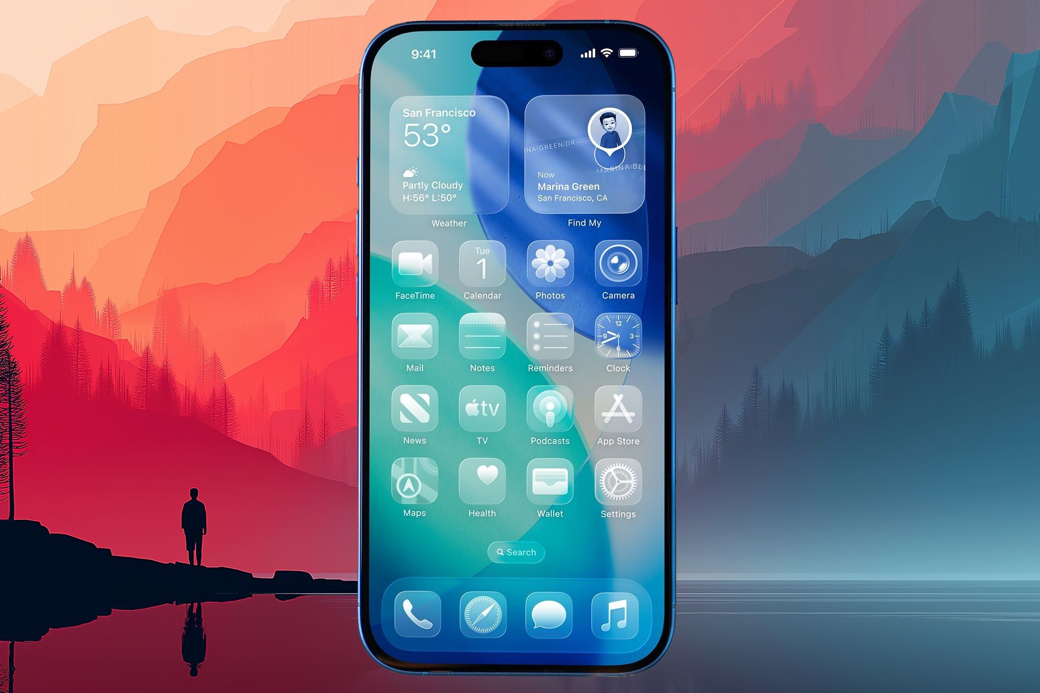
- Apple’s flashy new design: The iOS 26 update introduces a “Liquid Glass” design language across the iPhone interface, adding translucent, glass-like menus, icons and animations. The UI now shimmers and refracts light with lively transparency and parallax effects techradar.com, making the software feel more dynamic than it has in years.
- Mixed reactions and nausea reports: While some applaud the futuristic visuals, many users are complaining that the glassy icons and glow effects are disorienting. On dark backgrounds, app icons appear “crooked” or distorted due to a glowing border, causing dizziness and even nausea for sensitive users bild.de heise.de. Social media posts describe the new look as an “optical nightmare” and some say it “makes me feel drunk” bild.de.
- No full off-switch (but there’s a workaround): Apple offers no setting to completely disable Liquid Glass in iOS 26 bild.de. However, you can tone it down – enabling “Reduce Transparency” in Accessibility settings will strip away most of the translucency and glows, making menus opaque and easier to read bild.de. This essentially “de-liquifies” the interface to feel more like older iOS versions 9to5mac.com.
- Early bugs hit key features: The initial iOS 26 rollout hasn’t been smooth for everyone. Notably, Face ID broke for a number of users right after updating – the iPhone wouldn’t recognize any face until fixed phonearena.com. Fortunately, a forced restart and re-setup of Face ID restored the unlock feature in most cases phonearena.com. Apple is reportedly preparing a quick iOS 26.0.1 patch to resolve this glitch.
- Battery drain after update – temporary: Many noticed battery life took a dive and phones ran hot right after installing iOS 26. Apple reassures this is normal for a big update: the system is busy re-indexing files, updating apps, and downloading content in the background, which can temporarily tax the battery and CPU t3n.de. After a day or two, things should stabilize to normal. (Every year, similar complaints surface after major iOS updates t3n.de.)
- Packed with hidden upgrades: Beyond the headline features, iOS 26 is full of small “quality-of-life” improvements. There are at least 18 hidden new features – from letting you customize alarm snooze times and create ringtones right on the device, to live call screening, adaptive power saving, 3D wallpapers and more howardforums.com brandsynario.com. These tweaks don’t grab headlines but can make everyday use smoother and more personal.
A Bold New Look: What Exactly Is “Liquid Glass”?
Apple gave iOS a dramatic visual overhaul in version 26, its biggest design change in a decade. Liquid Glass is the company’s term for the new translucent, glass-like aesthetic applied system-wide. Think of the frosted glass panels of macOS or Windows Vista’s Aero Glass – but even more pronounced on a phone screen androidcentral.com. Virtually every UI element in iOS 26 got redesigned to fit this theme. Menus, buttons, notifications, and even app icons now have subtle transparency, glossy blurs, and dynamic lighting effects so that they “behave like glass in the real world” 9to5google.com.
Apple’s goal was to make the interface feel “alive” and delight users with a fresh look. Animations are livelier and more responsive, and light appears to refract through on-screen panels as you move between apps techradar.com techradar.com. The notification and Control Center overlays, for example, cause content behind them to glint and blur as if viewed through glass. It’s a striking departure from the flat design Apple introduced back in iOS 7. In fact, many core apps and UI elements hadn’t seen such a major facelift since that iOS 7 overhaul androidcentral.com – making Liquid Glass a clear bid to wow users with something visually new.
Early impressions have ranged from excitement to shock. Reviewers noted that iOS 26 “overhauled the entire operating system” look, bringing consistent design tweaks that create real “wow” moments for longtime iPhone users androidcentral.com. Even mundane touches stand out – for instance, the lock screen keypad now glows subtly when pressed, and translucent toolbars magnify content beneath them for a layered depth effect techradar.com. In essence, Liquid Glass is Apple blending form and function: part eye-candy, part a refresh of many UI layouts. But this bold new coat of paint hasn’t pleased everyone, as we’ll see next.
User Backlash: When a “Futuristic” UI Becomes an “Optical Nightmare”
Not all users are enamored with Liquid Glass. In fact, the design has kicked off a firestorm of complaints on Reddit, X (Twitter), and Apple’s own forums bild.de bild.de. The biggest sore point? Those new “glassy” app icons on the home screen. As part of the redesign, Apple applied a faint blurred glow around most app icons, especially ones with white backgrounds or bright colors techradar.com techradar.com. The intention was likely to make icons feel like they’re under glass, reflecting light. But many users say the result just makes icons look blurry or crooked.
On dark wallpapers or in Dark Mode, the effect is exaggerated. Users describe icons appearing tilted or oddly shaped due to the glow, which creates a kind of “tilt-shift” illusion around the edges heise.de. “I updated to iOS 26 and was honestly pretty shocked when I saw my home screen in dark mode,” one Reddit user wrote. “The border ‘glow’ effect makes the apps look slanted, and it’s super distracting… it even makes me a bit dizzy,” the user reported heise.de. Others chimed in “Now that I’ve seen it, I can’t un-see it”, and some called the dark mode look “cheap” or “like a drunk effect” heise.de bild.de. Multiple users claim prolonged use triggers real vertigo, eye strain or nausea bild.de.
Even those not feeling sick have aesthetic gripes. Some app developers and designers dislike that Apple is forcing a uniform blur onto app icons, altering the look of beloved logos. “Unlike the rest of Liquid Glass, this one-size-fits-all blurry filter represents Apple at its worst – overbearing and aestheticizing to a fault. I can’t imagine Google is thrilled about the iconic YouTube logo looking all smudged,” one tech reviewer remarked techradar.com. There’s also an optional setting to make icons fully transparent (“Clear” icons), which Apple added as a stylistic experiment. But this has been panned as borderline unusable – testers found translucent icons nearly impossible to identify against the background, unless you have only a few apps on screen techradar.com techradar.com.
Beyond icons, readability issues are another concern. With so many layered transparencies, certain text and buttons can be hard to discern, especially over busy wallpapers. Apple did tune the system to intelligently adjust contrast in many places, but users with less-than-perfect vision or sensitivity to motion are still struggling. Complaints of eye strain are not uncommon techradar.com. In fact, the Liquid Glass effects have proven so polarizing that a surge of people have even searched for ways to downgrade back to iOS 25 to escape the new look bild.de.
Can You Turn Off the “Liquid” Shine? How to Tone It Down
Apple hasn’t provided a direct “Off” switch for Liquid Glass – you’re stuck with the new design by default, like it or not bild.de. But for those who find it overwhelming or sickening, there is a built-in workaround: reducing the transparency and motion. Using an accessibility setting, you can significantly dial back the glassy visuals:
To reduce the Liquid Glass effect on iOS 26:
- Open Settings and go to Accessibility.
- Tap Display & Text Size.
- Toggle on “Reduce Transparency.”
This setting makes UI elements more opaque and high-contrast. Menus and overlays will appear flat (non-transparent) and without the frosted blur bild.de. Essentially, it “de-liquifies” much of the interface 9to5mac.com – users report that text becomes easier to read and the confusing glow around icons disappears when transparency is reduced. The trade-off is a less flashy look: some panels might look more plain or gray, lacking the depth effect. Still, for many this is worth the improved clarity. (You can also enable Reduce Motion to limit parallax animations if those make you queasy.)
It’s worth noting that Apple’s not alone in this design trend – transparency and motion have long been part of modern UIs. But usually there’s an option to disable them entirely. For example, macOS has a similar reduce transparency option, and Android’s Material design generally favors solid colors over extreme translucency. Given the backlash, there are already rumors that upcoming iOS 26.x updates might tweak or add toggles for some Liquid Glass elements techradar.com techradar.com. In fact, Apple just released an iOS 26 beta that “fixes the one thing everyone hated about Liquid Glass,” suggesting they’re addressing these complaints in software updates techradar.com techradar.com. Until then, the Accessibility settings are your best friend if Liquid Glass doesn’t agree with your eyes.
Surprise Glitch: Face ID Breaks for Some After Updating
Visual design aside, iOS 26’s launch brought a more practical headache for a chunk of users: Face ID stopped working. After installing the update, some iPhone owners found that their phone simply wouldn’t unlock with Face ID – the sensor failed to recognize them and would error out. This issue gained traction when one tech writer shared that his Face ID “just stopped working” as soon as he moved from the beta to the official iOS 26 release phonearena.com phonearena.com.
Life without Face ID can be a major pain, as iPhone users have become accustomed to frictionless unlocking and app logins with a glance. One affected user noted, “I was using my wife’s iPhone (who never set up Face ID) and thinking how crazy it’d drive me to type a passcode every time… then my Face ID broke [after updating]” phonearena.com. For those impacted, the Face ID toggle in Settings would even gray out, preventing re-setup. Traditional fixes like rebooting the phone didn’t help.
The good news: there is a quick fix that worked for most people: performing a forced restart and then resetting Face ID. This is slightly different from a normal reboot. It requires pressing volume up, then volume down, then holding the side power button until the device forcibly restarts phonearena.com. After doing this hard reboot, users report that iOS finally allows Face ID to be set up again, and the face recognition starts working normally phonearena.com. One writer confirmed “I turned my iPhone back on and reset Face ID, and this time I was allowed to reset… Face ID was fixed!” phonearena.com.
Apple hasn’t formally acknowledged this bug, but numerous posts on Apple’s forums detail the same Face ID failure on iOS 26 phonearena.com. The timing suggests a software bug in the initial release. A minor iOS 26.0.1 update is rumored to be imminent with a build already in testing phonearena.com, so Apple will likely squash this soon. In the meantime, if you run into Face ID issues after updating, try the forced restart + re-enable Face ID procedure. And don’t forget to turn back on the Stolen Device Protection setting if you had to disable it during troubleshooting phonearena.com phonearena.com – that feature (new in iOS 26) requires Face ID for certain security tasks, and it can block resetting Face ID until turned off.
Why Your Battery Might Be Dying Post-Update
If your iPhone’s battery life suddenly tanked after installing iOS 26, you’re not alone – but there’s likely nothing wrong with your device. Every year when Apple pushes a major iOS upgrade, users notice their phones running warmer and draining faster for a day or two. iOS 26 was no exception, and social media filled with reports of unusually short battery life right after updating t3n.de t3n.de.
Apple has explained why this happens, and it’s not a bug – it’s basically your iPhone doing housekeeping. In an official support note, Apple says “immediately after a major update, you may experience temporary battery life and thermal performance issues” t3n.de. In plain terms: the phone is working overtime in the background, and that heat and battery drain is a side effect t3n.de t3n.de. After an update, iOS is busy re-indexing files for Spotlight search, syncing and downloading new app data and assets, updating all your apps, and more t3n.de. All this computation can make the phone warm and chew through battery faster than usual. Once these background tasks finish – usually within 24-48 hours – battery usage should return to normal t3n.de.
This isn’t unique to iOS 26; it’s been observed with past updates too t3n.de. So, if your phone’s battery life seems worse right after upgrading, give it a little time. However, if issues persist beyond a few days, then it could indicate an app misbehaving or a genuine bug. In that case, check Settings > Battery to see if a particular app is draining abnormal power t3n.de. iOS 26 makes this easier by letting you tap “Show Activity” to get detailed per-app battery usage over 24 hours or 10 days, so you can identify any energy hogs t3n.de.
Apple also notes that some new features can have minor ongoing impacts on battery life – things like the new intelligent features or background services might use a bit more power depending on usage t3n.de. iOS 26 even introduced an Adaptive Power Mode on certain models, which can automatically throttle performance if it detects unusually high power drain t3n.de t3n.de. (For example, the iPhone 15 Pro and up can now proactively slow itself and alert you if it notices rapid battery depletion, thanks to this adaptive mode t3n.de.) You can manually enable Low Power Mode as well, which now even supports automation via Shortcuts for scenarios like bedtime t3n.de.
One myth to dispel: force-closing your apps will not improve battery life – in fact it can worsen it. Apple’s engineers have pointed out that apps shown in the multitasking view are often either suspended in RAM or not running at all; swiping them closed unnecessarily can waste energy t3n.de t3n.de. So, to save battery, stick to proven methods: reduce screen brightness, use Low Power Mode, and maybe disable any unnecessary background refresh – but don’t bother constantly killing apps.
Wowing Your Lock Screen: New 3D “Spatial” Wallpapers
Design drama aside, iOS 26 also brings some fun wallpaper and lock screen enhancements. Notably, you can now give your iPhone lock screen a slick 3D depth effect with minimal effort. This builds on the depth-aware wallpapers Apple introduced before, but cranks it up with motion. With iOS 26, your wallpaper can subtly move in 3D as you tilt your phone, creating an almost holographic illusion.
Here’s how it works: When you set a photo as your lock screen background, iOS will automatically detect if it has a discernible subject and depth (like a person or object in foreground). Now in iOS 26, an option appears (a little 3D landscape icon) that you can tap to enable the “Spatial” depth effect t3n.de. Once activated, the iPhone uses its motion sensors to shift the wallpaper slightly as you move the device, so the scene appears dimensional – almost like looking through a window that moves with you t3n.de. It’s a neat visual trick: the background parallax effect makes the subject pop out from the screen.
Setting up a 3D wallpaper is pretty simple:
- Go to Settings → Wallpaper → Add New Wallpaper, and pick a photo (you’ll see a special depth icon on eligible pictures).
- After choosing your widgets and clock style, tap the crossed-out “depth” icon in the bottom toolbar to turn on the spatial scene. The phone will take a moment to process, then your lock screen comes to life with a layered 3D look.
- You can preview it by tilting the phone; the perspective of the wallpaper will shift slightly – giving a sense of real depth t3n.de.
A few caveats: This feature requires a relatively modern iPhone – it works on iPhone 12 and newer, but not on the older iPhone 11 series or second-gen iPhone SE t3n.de. Also, when you enable the 3D effect, one thing you lose is the automatic font scaling for the clock. Normally, iOS will dynamically adjust the clock size or placement if it overlaps the wallpaper subject (to ensure good visibility). With the 3D scene on, that auto-adjust is disabled, so you’ll need to manually set your clock style/size during setup for optimal visibility t3n.de.
Overall, it’s a purely aesthetic feature – it doesn’t change functionality, but it can make your lock screen look more “next-gen” and playful. Combined with Liquid Glass’s animations, it’s clear Apple is leaning into visual flair this cycle. For those who enjoy customizing their phone’s look, the new wallpapers with “wow effect” (as some have called it t3n.de) are a welcome addition. And if you don’t care for it, you can simply not enable the depth toggle when choosing wallpapers.
Dozens of Hidden Gems: Quality-of-Life Features in iOS 26
Beyond the headline changes (Liquid Glass and a slate of new AI-powered “Apple Intelligence” features), iOS 26 quietly delivers a trove of smaller improvements that make everyday tasks easier. Tech reviewers have tallied at least 18 “hidden” features and tweaks that most users wouldn’t notice at first glance howardforums.com. These aren’t gimmicks – they’re practical enhancements that refine the iPhone experience. Here are a few of the most noteworthy:
- Customizable Snooze for Alarms: At long last, you’re not stuck with the default 9-minute snooze. iOS 26 lets you set your own snooze duration – anywhere from 1 to 15 minutes – for each alarm in the Clock app howardforums.com. If the classic “9 minutes” felt too short or long for you, now you can tailor it to your morning routine.
- Create Ringtones on the Fly: Making custom ringtones used to require GarageBand or a computer. Now you can simply use an audio file on your iPhone – find an MP3 or M4A in the Files app, tap Share, and choose “Use as Ringtone.” iOS 26 will instantly add it to your sounds list brandsynario.com brandsynario.com. (No, Apple Music songs still can’t be used due to DRM, but this is great for personal recordings or downloaded clips.)
- Live Call Screening: Taking a cue from Google’s Pixel, iPhones can now screen unknown callers. When an unknown number rings, you’ll see a new “Screen Call” option – tap it, and the caller will be prompted to speak. You can view a live transcript of their response in real time, before deciding to answer or decline brandsynario.com. It’s like having a virtual assistant ask “Who is this and why are you calling?” so spam and robocalls can be filtered without you saying a word.
- Adaptive Power Mode: In addition to manual Low Power Mode, iOS 26 introduces an Adaptive Power feature (available on newer models) that automatically tweaks performance to save energy brandsynario.com. For instance, if you’re just browsing or listening to music, the system may downshift chip speeds to conserve battery, then instantly ramp back up when you launch a game or camera. It’s meant to optimize power usage without user intervention.
- Battery Charge Time Estimates: Speaking of power, when you plug in your phone, the lock screen now shows an estimate of time to charge – e.g. “13m to 80%” or “1h 20m to full” brandsynario.com. This small touch helps you plan quick top-ups at a glance. The estimate also appears in the Battery settings.
- Spatial Photos in the Gallery: The Photos app gained a whimsical feature called “Spatial Scenes.” It can take some regular photos and render them with a bit of depth and motion – almost like a pseudo-3D model of the scene howardforums.com. By tilting your phone or moving it, you can explore the photo from slightly different angles (it’s similar to Facebook’s 3D photos or a mini panorama effect). It makes your memories feel a tad more immersive.
- Visual Intelligence for Screenshots: Ever screenshot something and then Google part of it? iOS 26 saves you a step. Now when you open a screenshot in markup, you’ll see options to “Ask” or “Image Search.” You can highlight any part of the screenshot (text or image) and instantly search the web or even ask ChatGPT about it brandsynario.com. It’s like having Google Lens and an AI helper built into the screenshot editor – great for getting context from an image or translating text, etc. (Be mindful: using these shares the screenshot with external services brandsynario.com.)
- Lyrics Translation in Apple Music: If you listen to music in other languages, Apple Music now has a translate feature. In the lyrics view, a “Translate” option shows line-by-line translations beneath the original lyrics for supported songs brandsynario.com. Singing along in Spanish but want to know what it means in English? Now it’s a tap away – a boon for language learners or just broadening musical appreciation.
- AirPods as a Camera Remote: Your AirPods can do more than play audio – with iOS 26, they function as a remote shutter for the camera. Set up your iPhone for a group photo or selfie, and simply double-tap an AirPod (2nd gen or newer) to snap the picture brandsynario.com. No more rushing to beat the self-timer or awkwardly asking a stranger to take your photo!
- Custom Chat Backgrounds: iMessage gets more personal – you can now set custom backgrounds for individual conversations brandsynario.com. It could be a color gradient, a favorite photo, or even an AI-generated pattern. Only you see it on your device (it doesn’t send to the other person), and you can change or remove it any time. It adds a little flair and makes differentiating chats easier, similar to features popular in WhatsApp/Telegram.
- Built-in PDF Editing: iOS 26 adds a Preview-style PDF editor. Open a PDF in the Files app or Mail, tap Markup, and you’ll find tools to highlight text, add notes or signatures, and even rearrange or delete pages brandsynario.com. Previously you might need a third-party app for heavy PDF editing; now it’s native.
- New Navigation Gesture: Apple extended the swipe-to-go-back gesture. You no longer have to reach from the far left edge – now you can swipe inward from the middle of the screen to navigate back in apps like Safari, Mail, Settings, etc. brandsynario.com. This is a small change but big for usability, especially on the larger screens, as it reduces hand gymnastics for one-handed use.
- Satellite Weather and SOS Improvements: If you’re ever off the grid, your iPhone (newer models with satellite capability) can now fetch basic Weather updates via satellite brandsynario.com. So even with no cell signal, you could get current temperature or rain forecasts – indicated by a little satellite icon. This complements the Emergency SOS and Find My via satellite features, further leveraging that hardware.
- Camera Lens Alerts & HDR Screenshots: Photographers will appreciate two touches – iOS 26 can detect lens glare or smudges and will pop up a message suggesting you clean the lens if it thinks your photos are getting artifacted brandsynario.com. And when you take screenshots, they are now in full HDR if your display supports it brandsynario.com, meaning screenshots preserve bright highlights and shadow detail exactly as seen, which is useful for showcasing the true appearance on XDR displays.
Whew – that’s a lot of little improvements! Apple didn’t shout about these on stage, but together they make iOS 26 feel polished and modern. It’s worth exploring Settings and various apps to stumble upon these new options, as they can genuinely make your iPhone more convenient and fun to use brandsynario.com. And given how feature-packed this release is, it’s understandable why Apple needed that extra design flourish to mark the occasion.
How iOS 26 Stacks Up Against Android’s Latest (Material You vs. Liquid Glass)
Whenever Apple makes a big change, it’s natural to compare it to what’s happening in the Android world. Interestingly, around the same time as iOS 26’s Liquid Glass debut, Google rolled out Android 16 with a “Material 3 Expressive” design update on Pixel phones androidcentral.com. Both are attempts to refresh mature mobile OS interfaces – but they take almost opposite approaches.
Apple went for a visual spectacle, revamping the entire look of iOS with translucent layers and flashy animations. Reviewers note that Liquid Glass is a far bigger visual overhaul than what Google did – it truly gives iOS a whole new aesthetic, akin to a “fresh coat of paint” everywhere androidcentral.com androidcentral.com. It’s comparable to the leap from skeuomorphic iOS 6 to flat iOS 7 in terms of how different it feels. If you put iOS 26 next to Android, it makes Android’s interface (even with Material You theming) look relatively flat and static by comparison.
Google’s Material 3 Expressive, on the other hand, is more about subtle functional improvements. Android had already introduced Material You a few years ago, which dynamically themes UI colors based on your wallpaper. The new Expressive update builds on that with tweaks like bolder, adaptive colors and enhanced animations with haptic feedback. For example, when you swipe away notifications on Android 16, they “spring” together and snap with a vibration, giving a tangible feel to the action androidcentral.com androidcentral.com. Google focused on making interactions feel smoother and more natural, rather than adding a lot of gloss. Visually, Material 3 Expressive isn’t a radical departure; many changes are in the details of how elements move or respond to touch, and Google updates its apps continuously, so the change is gradual androidcentral.com androidcentral.com.
In short, iOS 26 wowed users with eye candy, while Android 16 aimed for refinement. One isn’t necessarily better than the other – it’s a difference in philosophy. In fact, some designers have pointed out that Apple’s bold approach has downsides: “Multiple translucent layers can get tricky to see when piled on… pulling down Control Center over the App Library can make your head spin,” an Android Central editor observed about Liquid Glass androidcentral.com. Android’s UI, by contrast, tends to prioritize clarity (solid backgrounds, consistent iconography) and let users personalize colors.
For consumers, the benefit of this competition is clear: both iOS and Android are evolving in their own ways. Apple is bringing fun and flair back to the iPhone interface (after years of mostly minor visual changes), and Google is pushing customization and ergonomic interactions. Interestingly, both platforms now offer things that were once unique to the other – e.g., iOS adopted an Always-On display and customizable lock screens recently (features Android had for ages), and Android is mimicking iOS with things like live voicemail transcription (call screening) and improved continuity between devices. The gap is closing, yet the user experience retains each platform’s distinct flavor.
If Liquid Glass proves too controversial, Apple might dial it back or give more options in iOS 27. Or maybe users will get used to it and come to love the liveliness it adds. Either way, it’s a bold swing by Apple to keep iOS feeling fresh, and it certainly has people talking – for better or worse.
Bottom Line
iOS 26 is one of Apple’s most consequential updates in years. It delivered a dramatic new look with Liquid Glass that immediately divided the fan base – some are delighted by the vibrant, modern vibe; others literally felt sick and clamored for a way to turn it off. Alongside that, the update packed meaningful usability upgrades (once you dig past the shiny surface) – addressing long-standing user requests and adding clever new capabilities like call screening, smarter battery management, and more.
Yes, there were some early stumbles: a nasty Face ID bug and the usual post-update battery slump. But those are either already fixed or fleeting issues. What remains is a feature-rich OS that’s pushing the envelope on design. Apple took a risk with Liquid Glass, and the mixed reaction shows that big UI changes are always a tightrope walk. If you love it, you’re in for a treat; if you hate it, remember you can mitigate it via settings – and take solace that iOS updates yearly, so nothing is permanent.
One thing’s for sure: between the “schwindel” (dizzy) icons bild.de and the hidden gems under the hood, iOS 26 has given everyone something to talk about. It’s made the iPhone feel new again – sometimes uncomfortably so. Now it’s up to Apple to refine this vision and up to users to decide if this glossy new experience truly “shines” or if it’s all just a bit too much gloss on the glass.
Sources: Apple Community Forums; BILD bild.de bild.de; Heise Online heise.de; TechRadar techradar.com techradar.com; PhoneArena phonearena.com phonearena.com; t3n t3n.de t3n.de; 9to5Mac 9to5mac.com; Android Central androidcentral.com androidcentral.com; Brandsynario/CNET brandsynario.com brandsynario.com.
